
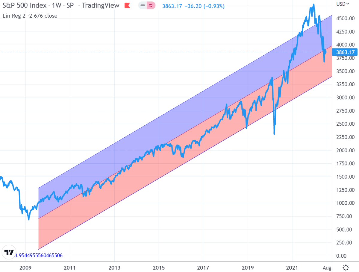
"The regression chart alone suggests that statistically, the risk of shock to the downside is far greater than the chance we are in some kind of enchanted new normal for stock price behaviour. The chart says a full mean reversion would take the index to about 4000."
Four months later, on 8th May 2022, the S&P had fallen 7.4% percent, to 4123; and in my article "Is Now A Good Time to Enter The Market?", I said:
"A technical analyst looking at the downwards ‘signal line crossover’ in February, might call that a pretty strong negative signal.
"Regardless of whether you're an expert, or have never even seen a chart like this before, does it feel like it's trying to tell us something? ... if we’re investing new money, it’s nice to check that we’re investing with the market trend, not against it. There’s no harm to wait for the needle to swing positive again... we could be smartly avoiding some serious downwards mean-reversion that's about to unfold."
Two months later, 17th July 2022, the S&P500 closed the week at 3863. A further 6.3% fall.
So, the question "Are we there yet?" is a valid one to be considering. Has the needle started to swing positive?
Let's look at the charts.
Firstly, here's the linear regression. As we can see, the S&P500 index has now reverted from it's peak of around 4800 in December, to the region around the central regression line. At this point, the chart doesn't tell us anything meaningful - remember, reversion happens when the data points are at an extreme, and statistically more likely to move back towards the mean.
Now let's look at the weekly chart. As previously mentioned, for trend following, I like to use Heikin Ashi bars, rather than the traditional open-high-low-close candlesticks; it makes visualisation of a trend easier. Red is downwards, green is upwards.

A bit like the regression chart, the above is unhelpful, being pretty much hovering within a range during recent weeks. Also the SAR is still negative (yellow blobs are above the bars, not below). On the other hand, the MACD is very low and there is a vague hint that an upward curve might be about to emerge. Also the Williams %R has just popped back up above the -80 line, generally positive.
Overall the weekly chart may indicate a change in trend is approaching, but there's no confirmation here yet.
The monthly chart however, as previously, is still emphatically downwards.

If we are 'there yet', then the natural order of things would be the 'faster' (but less meaningful) weekly chart turning positive, followed a few weeks later by the 'slower' (but more meaningful) monthly chart doing the same. This is not showing in the charts. It may turn out that we are indeed at the cusp of an upturn, but this isn't confirmed yet.
Hence, my remarks in the earlier article remain relevant:
If we’re investing new money, confirm that we’re investing into a market uptrend, not against it. The worst that can happen is we miss out on a bit of upside.
I stress that this isn't 'market timing'. We're not attempting to sell and buy in tune with short-term market swings. Similarly, the above is specifically in respect of lump sums. If we are drip-feeding money into the market over a period of time (aka Dollar Cost Averaging), we should already be excited.
Have a wonderful week ahead.