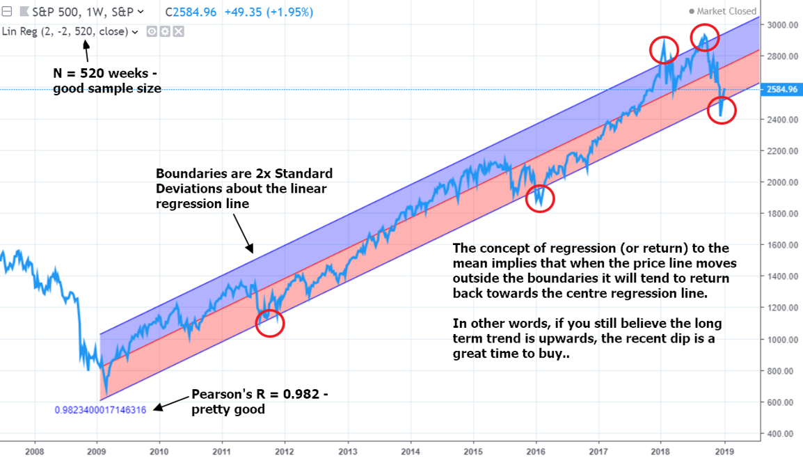
21/1/2022. On 10th January 2019, I posted an article “S&P500 Ready For Huge Rebound Says Linear Regression Chart”. That day, the S&P500 closed at 2596.
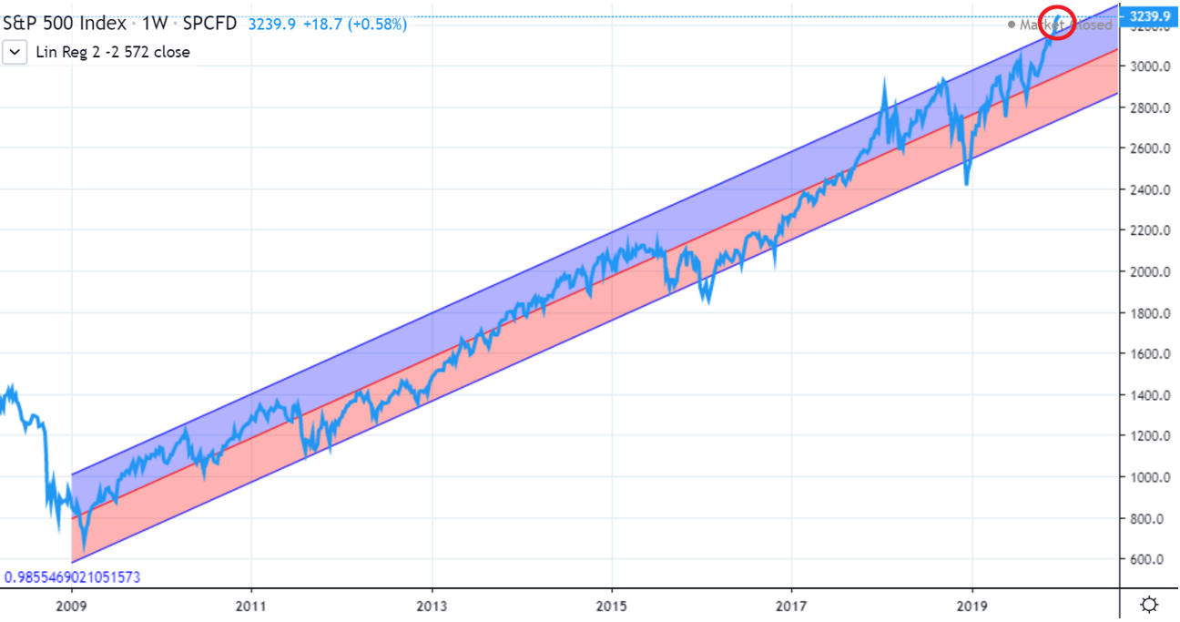
By 27th December, the index was closing at 3240; 25% higher.
Then I posted an article “S&P500 Due For Correction, Says Linear Regression Chart”.
Less than three months later, on 23rd March 2020, the index closed at 2237; 30% lower.
No magical predictive powers here – we all know that markets go up and down. The concept of mean reversion says that if data points are at the edges of the long-term trend, then odds are stronger they will veer back towards the mean, and weaker they will continue to outlie. (Boundaries are 2 standard deviations in the chart below.) The trend itself has to still be in play, of course.
Note this doesn’t mean that the COVID pandemic could have been be forecast – just that there was a much greater risk to the downside than the upside. Good things don’t last forever. (The first linked article explains the technical side of this principle in more depth.)
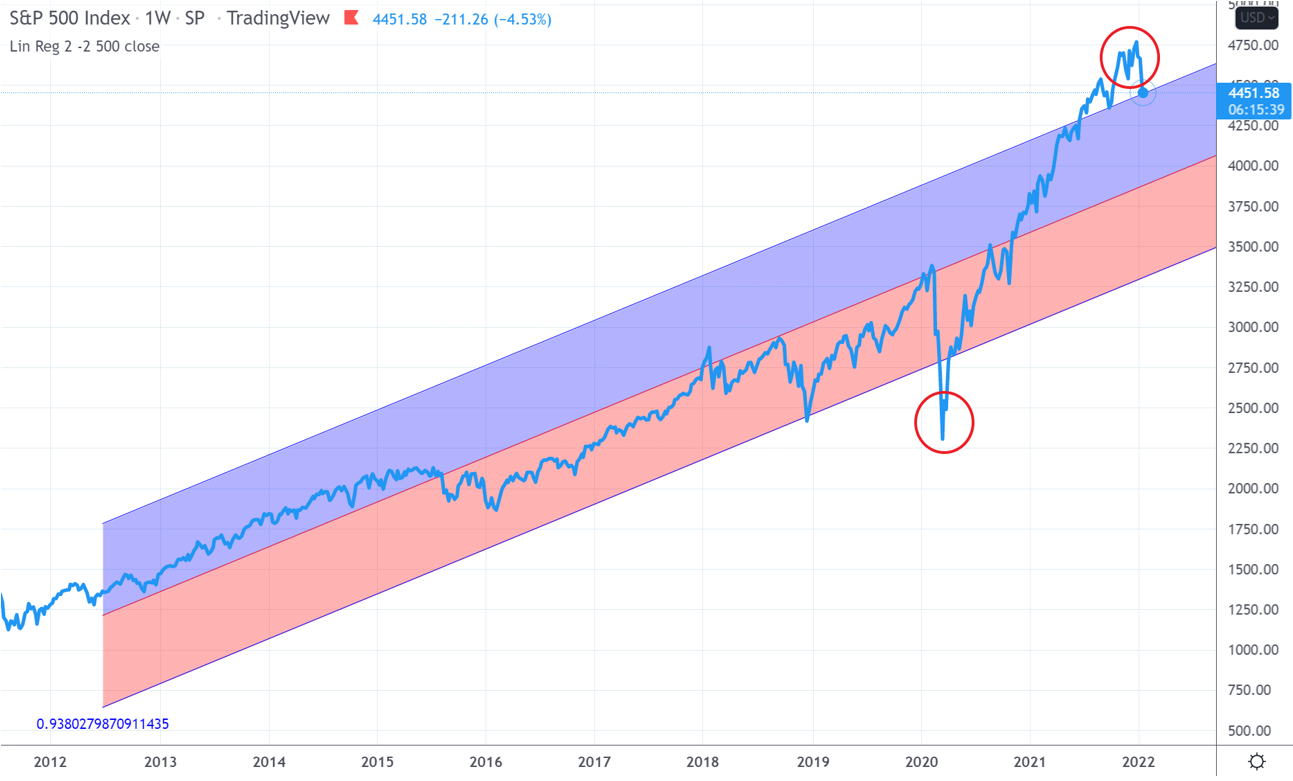
Let's look at the same chart today.
The post-pandemic volatility of the index has widened the 4SD zone hugely, and after such a plunge in March 2020, naturally a return to the mean gave the index plenty of scope for upside. But the S&P500 powered through, bursting past the upper 2SD boundary in mid-2021.
Bursting is a good word; bubbles burst. Maybe we’ve witnessed the emergence of some kind of post-pandemic new economy. Or more likely, a correction has been due for a while, as the index has struggled for weeks to make any meaningful headway.
The current environment is historically high inflation (40 years in USA, 30 years in UK), interest rate rises, overheated TMT stocks, ongoing COVID-measures impact, global supply chain dislocation, and China not yet accepting that probably everyone will get Omicron (the world’s second largest economy cannot continue to function within a zero-Covid strategy).
And the regression chart alone suggests that statistically, the risk of shock to the downside is far greater than the chance we are in some kind of enchanted new normal for stock price behaviour. The chart says a full mean reversion would take the index to about 4000.
Do we know if this will happen? Nope. Can we predict if the index will fall through the mean to ultimately bounce at the lower rail? Nope. Charts are not predictive; they are just tools to help us think, and get perspective. They are just one signal among thousands.
Everyone is an investment genius when markets are spiralling upwards, but corrections punish the greedy. What's important is patience, a calm head, and trust in your asset allocation.


